I’ve been enjoying the ninth Rugby World Cup and looking forward to seeing the All Blacks take their third title in a row. Unfortunately “sport happened”, and the top-ranked team were comprehensively taken out in the semi-final by England.
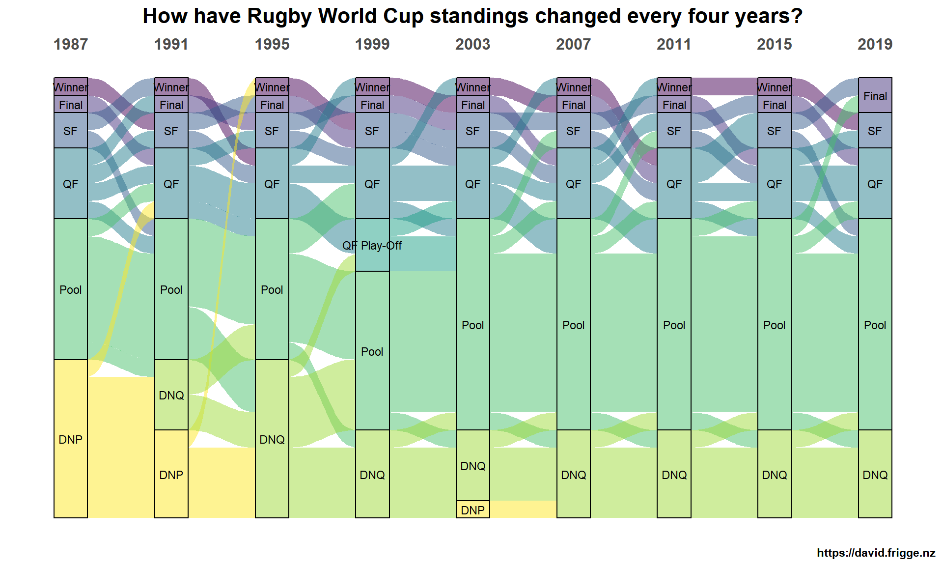
I’ve been playing around with some of the match data, but at this point I’m particularly moved to look back over the history of the cup. The competition has space for 20 teams (originally 16) and 25 different teams have taken part at various times over the past 32 years. How have the standings changed from tournament to tournament, ie the highest level each team reached?
An alluvial or Sankey diagram works well to show the ups and downs. Whilst there is much less variability than more globally competitive sports there has still been a lot of movement. An interesting fact that popped out at me is that for four tournaments in a row (1999-2011) the winner had only reached the quarter-finals four years previously. If England wins on Saturday they’ll be the first country to win after not escaping pool play in the previous tournament.
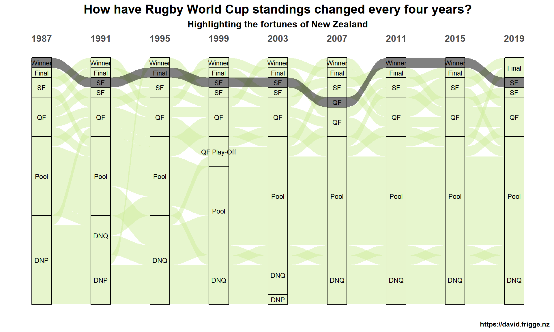
Whilst it’s disappointing that the All Blacks “only” made the semi-final in 2019, we can be proud of the history over the past 32 years. They’ve got the best record of any country, and New Zealand continues to punch above its weight. We can highlight New Zealand’s standings in the diagram like so.
Data
Code listing
The first graph is created with the following code.
library(magrittr)
library(glue)
library(readr)
library(dplyr)
library(tidyr)
library(purrr)
library(ggplot2)
library(ggalluvial)

standings <- read_csv("data/rwc_standings.csv")

rwc_groups <- c("Winner", "Final", "SF", "QF", "QF Play-Off", "Pool", "DNQ", "DNP")

standings %<>%
  pivot_longer(cols = -Country, names_to = "Year", values_to = "Stage") %>%
  mutate(n = 1)

standings_f <-
  standings %>%
  mutate(Stage = factor(Stage, level = rwc_groups))

ggplot(standings_f,
       aes(x = Year, stratum = Stage, alluvium = Country,
           y = n,
           fill = Stage, label = Stage)) +
  scale_x_discrete(position = "top") +
  scale_fill_viridis_d() +
  geom_flow() +
  geom_stratum(alpha = .5) +
  geom_text(stat = "stratum", size = 3) +
  theme(legend.position = "none",
        panel.background = element_blank(),
        axis.ticks = element_blank(),
        axis.text.y = element_blank(),
        axis.text.x = element_text(size = 12),
        axis.title = element_blank(),
        text = element_text(family = "Arial", face = "bold"),
        plot.title = element_text(hjust = 0.5, size = 16),
        plot.subtitle = element_text(hjust = 0.5, size = 12)) +
  labs(title = "How have Rugby World Cup standings changed every four years?",
       caption = "https://david.frigge.nz",
       x = NULL, y = NULL)
The second is created with the following R code, manually doubling the categories to account for being the highlighted country or not. Adjust the obvious variable to highlight a different country.
HIGHLIGHT_COUNTRY <- "New Zealand"
rwc_groups_hl <-
  rwc_groups %>%
  map(~ c(paste("HL", .), paste("ZZ", .))) %>%
  flatten() %>%
  unlist()
standings_hl <-
  standings %>%
  mutate(HLStage = factor(if_else(Country == HIGHLIGHT_COUNTRY, paste("HL", Stage), paste("ZZ", Stage)),
                          levels = rwc_groups_hl),
         highlight_colour = if_else(Country == HIGHLIGHT_COUNTRY, "black", "#cfec9c"))

ggplot(standings_hl,
       aes(x = Year, stratum = HLStage, alluvium = Country,
           y = n,
           fill = highlight_colour,
           label = Stage)) +
  scale_x_discrete(position = "top") +
  scale_fill_identity() +
  geom_flow() +
  geom_stratum(alpha = .5) +
  geom_text(stat = "stratum", size = 3) +
  theme(legend.position = "none",
        panel.background = element_blank(),
        axis.ticks = element_blank(),
        axis.text.y = element_blank(),
        axis.text.x = element_text(size = 12),
        axis.title = element_blank(),
        text = element_text(family = "Arial", face = "bold"),
        plot.title = element_text(hjust = 0.5, size = 16),
        plot.subtitle = element_text(hjust = 0.5, size = 12)) +
  labs(title = "How have Rugby World Cup standings changed every four years?",
       subtitle = glue("Highlighting the fortunes of {HIGHLIGHT_COUNTRY}"),
       caption = "https://david.frigge.nz",
       x = NULL, y = NULL)